时序分析学习笔记(一)
前言
一转眼2022年已经快过去一半了,这一天,笔者突然想起,自己已经好几个月没在博客更新文章了。不更新的理由倒并不是缺乏想写的东西,或者是懒得写文章之类的,仅仅是因为本人忘记了自己之前搭过一个博客而已(汗)。因此,在想起来有这回事后,本学渣再一次打开了文档,写点东西在这里。
当然了,除去本人智商较低的因素外,忘记博客的存在这件事还因为近期确实有点小忙。
一方面,学业上的事情很多,上个学期的SQL、Investment、Econometrics三门课几乎全都是零基础从头学起,同时教授讲的速度实在是有点过于快,超出了本人的智力能力,为了把这些课的搞明白,以及拿一个好成绩,就用了不少时间。
另一方面,由于本学渣并不是那种可以一门心思学习的人,一旦学习与娱乐的时间比超过1:3就无法承受了,因此,本人还需花更多的时间去打游戏、练琴、学课程专业无关的无用知识才能勉强恢复元气,这就占据了我几乎全部的可用时间。
而最后,最重要的是近期本人的睡眠质量可以说是历史最差的状态,夜里的睡眠无法维持超过四小时,且对各类微小的声音都极度敏感,平均半小时醒一次,尝试过褪黑素无果,这就导致了白天本人还得拿出几乎全部下午的时间进行低质量的休眠,进一步缩减了我的可支配时间。因此,能找到空闲来写这篇文章已经谢天谢地了。
言归正传,这篇文章的作用,主要是为了记录下本学期的时间序列分析(Intro to Time Series)一课。由于其引入了大量对于文科生出身的我来言难以充分理解的数学概念,以及高频的使用R代码,如果不做一些笔记的话,恐怕之后的案例分析会很难做,故在此记录下课程中的我认为较重要的部分,为之后的工作做准备。
当然,目前课程还只进行了一半,本文会随着课程进度,同步更新。
由于当前内容已经超出本文目录结构所能承载的极限,故本文完结,后续内容将在[时序分析学习笔记(二)]中继续。
统计预测的五步
这一部分为课程大纲中给出的框架,先将原文贴于此,日后可能会简单的翻译一下(大概率不会)。
A forecasting task usually involves five basic steps:
Step 1: Problem definition.
Often this is the most difficult part of forecasting. Defining the problem carefully requires an understanding of the way the forecasts will be used, who requires the forecasts, and how the forecasting function fits within the organization requiring the forecasts. A forecaster needs to spend time talking to everyone who will be involved in collecting data, maintaining databases, and using the forecasts for future planning.
Step 2: Gathering information.
There are always at least two kinds of information required: (a) statistical data, and (b) the accumulated expertise of the people who collect the data and use the forecasts. Often, it will be difficult to obtain enough historical data to be able to fit a good statistical model. In that case, qualitative methods can be used. Occasionally, old data will be less useful due to structural changes in the system being forecast; then we may choose to use only the most recent data. However, remember that good statistical models will handle evolutionary changes in the system; don’t throw away good data unnecessarily.
Step 3: Preliminary (exploratory) analysis.
Always start by graphing the data. Are there consistent patterns? Is there a significant trend? Is seasonality important? Is there evidence of the presence of business cycles? Are there any outliers in the data that need to be explained by those with expert knowledge? How strong are the relationships among the variables available for analysis? Various tools have been developed to help with this analysis.
Step 4: Choosing and fitting models.
The best model to use depends on the availability of historical data, the strength of relationships between the forecast variable and any explanatory variables, and the way in which the forecasts are to be used. It is common to compare two or three potential models. Each model is itself an artificial construct that is based on a set of assumptions (explicit and implicit) and usually involves one or more parameters which must be estimated using the known historical data. We will discuss regression models, smoothing methods, ARIMA models, as well as several advanced methods including GARCH and others.
Step 5: Using and evaluating a forecasting model.
Once a model has been selected and its parameters estimated, the model is used to make forecasts. The performance of the model can only be properly evaluated after the data for the forecast period have become available. A number of methods have been developed to help in assessing the accuracy of forecasts. When using a forecasting model in practice, numerous practical issues arise such as how to handle missing values and outliers.
时序分析:基础
开始一切分析前,简单却必要的一步,便是做一个数据的基础可视化:如观察其distribution(分布)、是否有outliers(异常值)、是否随时间移动?应变量与自变量的关系?诸如此类……
环境介绍
我们的所有操作,都是基于R语言环境,因此需要在计算机中先安装R运行时,为了脚本化更容易,之后还需安装RStudio,后续一切操作都是在RStudio中完成。
首先我们引入fpp2库
1 | library(fpp2) |
如果此时报错,则表示需先安装fpp2包
1 | install.packages("fpp2") |
这会在当前环境下加载如下内容:
- 一些案例数据
forecast包(包含一些预测函数)ggplot2包(包含一些绘图函数)fma包(包含许多时序数据)expsmooth包(包含许多时序数据)
由此,便可以开始基础分析了
ts对象以及ts方程
时序数据在R中储存在时序对象(ts object)中,记录了数据被记录时间以及数据的实值
如创建一个简单的时序对象:
1 | y < ts(c(123, 39, 78, 52, 110), start=2012) |
此时我们会拿到一个由2012年起的,为期5年的年度时序,储存在y中。
当然,我们也可以通过设置频率(frequency)来让时间并不仅仅为一年间隔
如创建一个月度数据:
1 | y < ts(z, frequency=12, start=c(2003, 1)) |
其中,z为月度数据,start为起始时间,此时,我们拿到一个由2003年一月起的月度时序,储存在y中
如果此时输入
1 | class(y) |
我们会得到‘ts',表示这是一个时序对象
那么,在日常使用中,我们不太可能用上述向量赋值的方式来创建对象,通常我们会读取一个已有的数据文件,如.csv文件,此时,我们做如下操作:
1 | apple <- read.csv(file = apple.csv) |
其中apple.csv是苹果公司某几年的季度销售数据
此时该apple.csv文件便储存在了apple变量中。
当然,此时的apple并不是时序对象,而是数据帧对象(DataFrame),那么如何将其转换为时序对象呢?
代码如下:
1 | apple.mac = ts( |
由此,我们提取了apple的mac在1998年第4季度到2018年第1季度的销售数据,并将其存在apple.mac中,而它为一个ts对象。
同理,我们也可以只提取ipone的数据:
1 | apple.iphone = ts( |
当然,我们也可以不提取单列,而是将其全部转换,此时只需要指定全部列名即可:
1 | apple.ts = ts( |
时间图(Time Plot)
简单来说,时间图绘图使用autoplot这一方程。
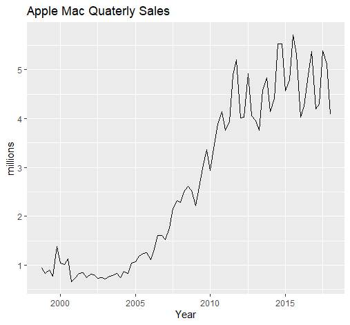
例如,绘制苹果Mac的季度销售数据:
1 | autoplot(apple.mac)+ |
我们会得到:
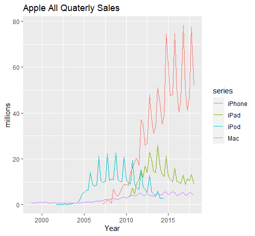
同理,我们还可以做全部产品销售数据的图:
1 | autoplot(apple.ts)+ |
可以得到:
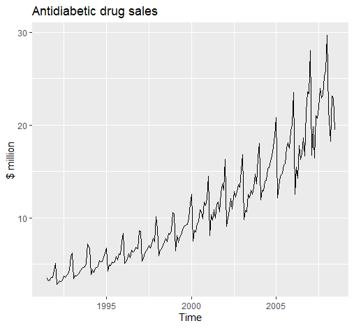
季度图(Seasonal Plot)
简单来说,绘制季度图,我们使用ggseasonplot函数
例如,我们绘制a10数据,这是一个fpp2中自带的糖尿病药物销售的数据:
1 | ggseasonplot(a10, year.labels = TRUE, year.labels.left = TRUE) + |
可以得到:
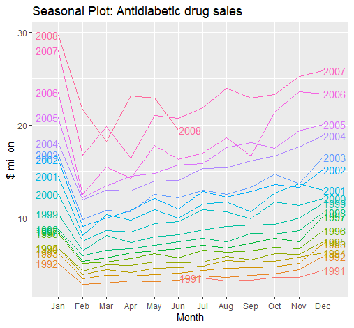
季度图可以直观显示出不同年的同一季的数据不同,使我们更容易发觉季与季之间的变化模式。
当然,这里的“季度”只是season的直译,并不意味这中文中的三个月一季的”季度“,上述例子便是以月份为一“季(Season)”
季节性子序列图(Seasonal Sub-series Plot)
简单来说,我们利用ggsubseriesplot绘制季节性子序列图:
1 | ggsubseriesplot(a10) + |
可以得到:
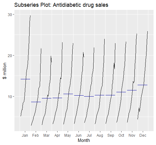
季节性子序列图(Seasonal Sub-series Plot)可以让我们看出每一“季”的变动趋势
时序模式(Time Series Patterns)
趋势性(Trend)
1 | autoplot(a10, year.labels = TRUE, year.labels.left = TRUE) + |
趋势性指数据存在长期性的增或减,如上图。
季节性(Seasonality)
1 | autoplot(a10, year.labels = TRUE, year.labels.left = TRUE) + |
季节性指数据以时间为固定周期,呈现循环,上图同样存在季节性。
周期性(Cyclicity)
1 | autoplot(hsales)+ |
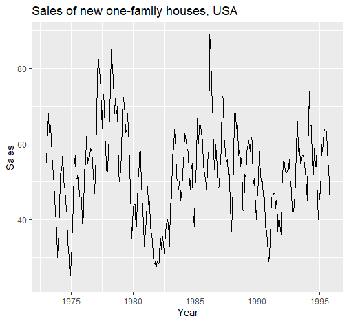
周期性与季节性相似,然而并不限制循环周期,且循环周期一般较长,如两年以上的周期,如上图。
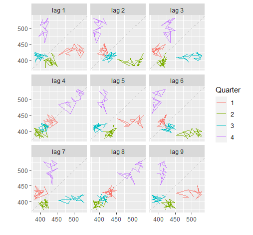
迟滞图与自相关(Lag Plots and Autocorrelation)
迟滞图(Lag Plots)
我们使用gglagplot来绘制迟滞图,如:
1 | beer <- window(ausbeer, start = 1992) |
自相关(Autocorrelation)
自相关(Autocorrelation)用于评估时间序列数据是否依赖于其过去的数据。
定义及具体算法比较麻烦,且应用层面无需涉及,故略去。
我们使用ggAcf绘制自相关方程图:
1 | ggAcf(beer) |
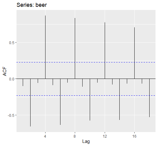
越接近1则越表示与过去数据相关
一般来说:
趋势性数据的自相关性较大且随时间减少的慢
季节性数据的自相关一般在季度迟滞值(指迟滞值为季度频率的倍数)较大
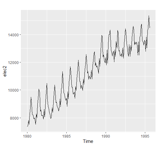
比如下述的一个既有趋势性又有季节性的例子中:
1 | elec2 <- window(elec, start = 1980) |
其ACF图为:
1 | ggAcf(elec2, lag.max = 48) |
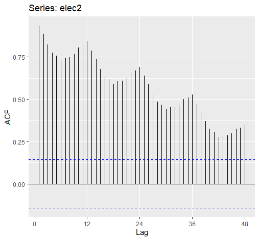
可以看出自相关性较大且随时间减少的慢且有季度的峰值波动。
白噪声(White Noise)
白噪声指无自相关的时序数据
假设我们创建一组随机时序:
1 | wn <- ts(rnorm(36)) |
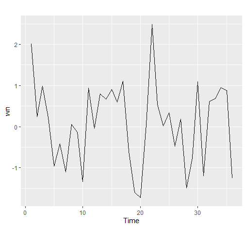
绘制其ACF图:
1 | ggAcf(wn) |
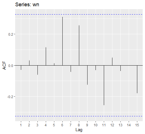
可以看出,所有值都低于蓝线(高于则意味着显著),即自相关不显著
初级预测法
平均法(Average Method)
以均值作为所有的预测值.
代码:
1 | mean(y, h=20) |
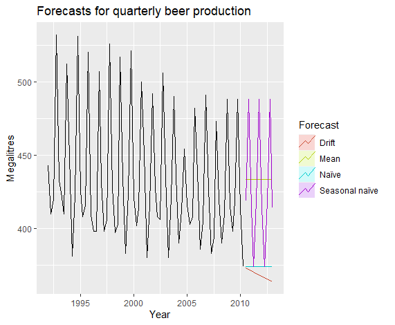
朴素法(Naive Method)
以最后一次观测到的数据作为预测值。
代码:
1 | naive(y, h=20) |
季节性朴素法(Seasonal Naive Method)
以每一季的最后观测到的数据作为预测值。
代码:
1 | snaive(y, h=20) |
漂移法(Drift Method)
1 | rwf(y, drift=TRUE, h=20) |
组合初始观测值与最后的观测值作为预测值。
例:
1 | beer2 <- window(ausbeer,start=1992,end=c(2007,4)) |
数据变形(Data Transformation)
数据整形主要是为了将某些特征显著化或者微小化
1 | autoplot(elec) + |
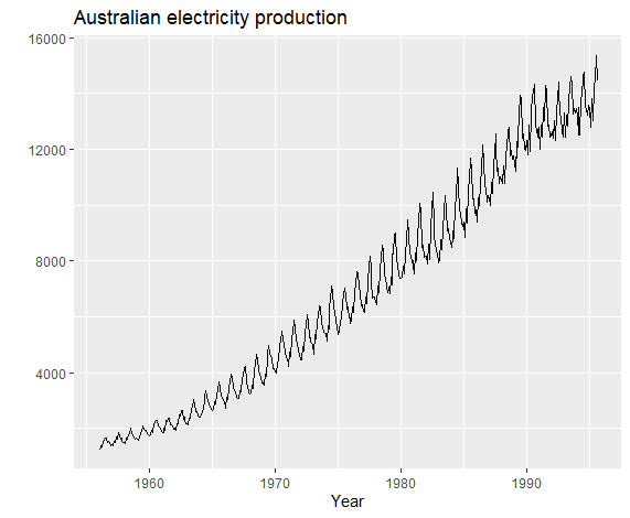
如上图,这是一组方差逐渐增大的数据,我们便可以通过数据变形,使其方差稳定化。
稳定方差,我们一般使用指数化,或者对数化,这里展示对数化方法。
1 | autoplot(log(elec)) + |
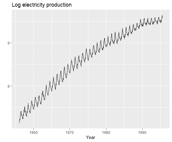
这样,方差便稳定化了。
而上述方法,都被归于了属于Box-Cox法,这是一个关于λ的分段函数,λ为0时,为自然对数变化,不为0时则是指数变化。这里就不贴出具体函数了,不重要。
代码如下:
1 | autoplot(BoxCox(elec,lambda=BoxCox.lambda(elec))) |
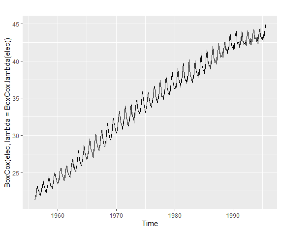
上述代码可以自动生成最优λ(由BoxCox.lambda(elec)实现),同时画出时序图。
残差检验(Residuals Diagnose)
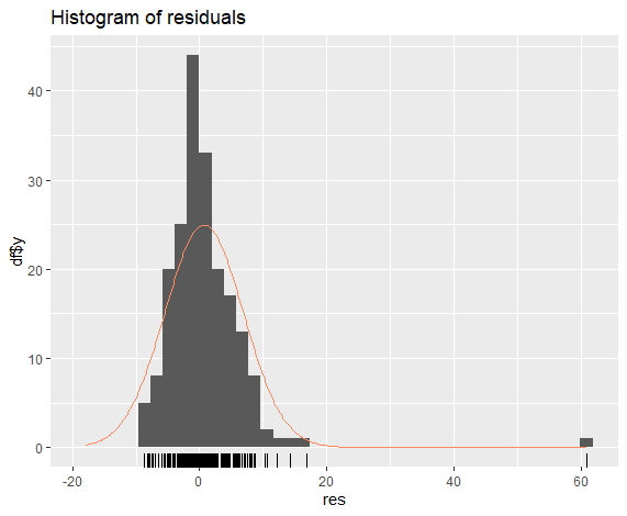
好的预测残差需要有如下特性:
残差需无相关性
残差均值为零
残差方差稳定(非必须)
残差符合正态分布(非必须)
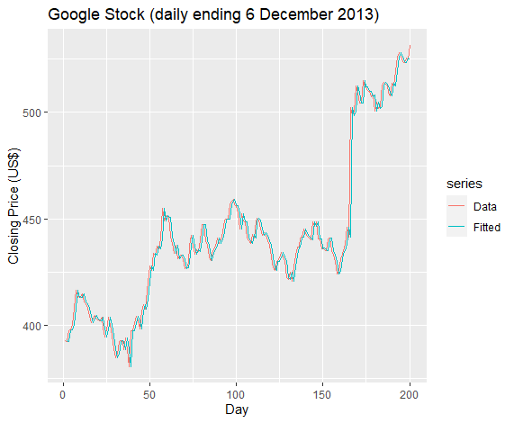
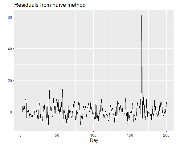
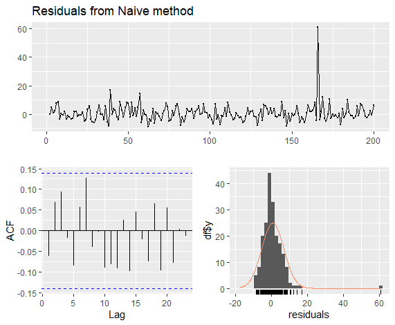
假设我们用naive法对于谷歌的数据进行预测,即用当天数据作为第二天数据的预测:
1 | fits <- fitted(naive(goog200)) |
然后我们计算残差:
1 | res <- residuals(naive(goog200)) |
1 | gghistogram(res, add.normal=TRUE) + |
1 | ggAcf(res) + ggtitle("ACF of residuals") |
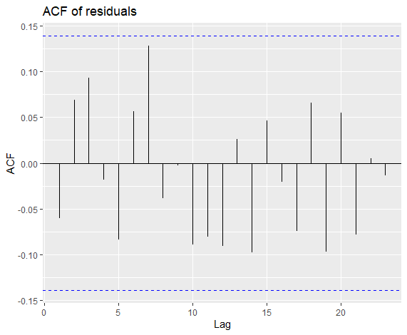
可以看出上述预测符合残差要求,
Box-Ljung Test
1 | Box.test(res, lag=10, fitdf=0, type="Lj") |
得到X-squared = 11.031, df = 10, p-value = 0.3551,即拒绝零假设,表示残差不和白噪声有显著区别(即可以认为是白噪声),得出模型是好的的结论。
上述全部过程都可以用一个打包好的代码实现:
1 | checkresiduals(naive(goog200)) |
X-squared = 11.031, df = 10, p-value = 0.3551
模型准确性检验(Accuracy)
此时,假设我们有了多个预测模型,那么该如何决定哪一个好呢?
一般来说我们采用的指标如下:
MAE
残差的均值
MSE
残差的平方的均值
RMSE
MSE的平方根
MAPE
(残差绝对值/实值绝对值)的百分值
MASE
(残差绝对值/时间量度)的均值
1 | beer2 <- window(ausbeer, start=1992, end=c(2007,4)) |
1 | > accuracy(beerfit1, beer3) |
如此我们便拿到了每个模型的分值,可以看出,SeasonalNaive法的结果最好。
最后,记录三个关于预测的判断正误题:
- 残差小的模型预测结果会好
不一定,例如“过拟合”模型残差极小,但预测能力差
- 如果一个模型预测不准确,那么我们应该增加它的复杂度
不一定,增加复杂度与准确率无关
- 只要在测试数据集上表现好的模型就是好模型
不一定,例如测试数据集如果太小,则这个好的表现就无意义
时间序列的线性回归
这部分内容比较基础,底层就是最小二乘法进行系数计算,略过不表。
1 | autoplot(uschange[, c("Consumption", "Income")]) + |
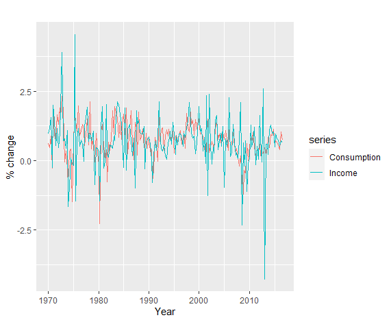
例如这里有两个时序数据,”Consumption”和”Income”,它们的散点图如下:
1 | uschange %>% |
或:
1 | ggplot(data = as.data.frame(uschange), aes(x = Income, y = Consumption)) + |
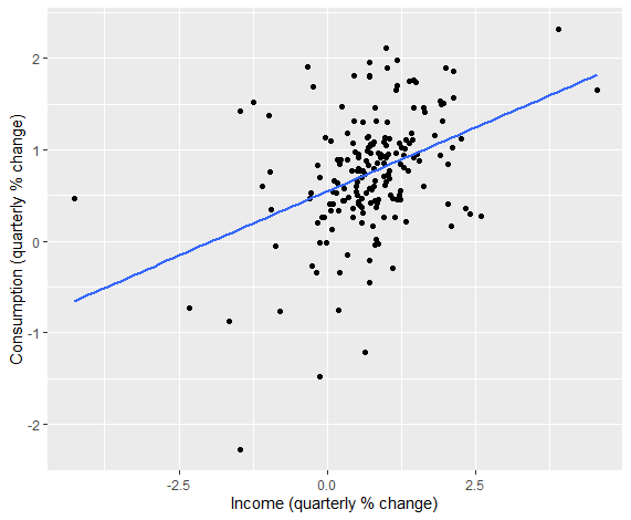
可见存在一定正相关。
进行时序回归:
1 | tslm(Consumption ~ Income, data = uschange) %>% summary |
得到结果:
1 | Residuals: |
在此基础上添加新的自变量:
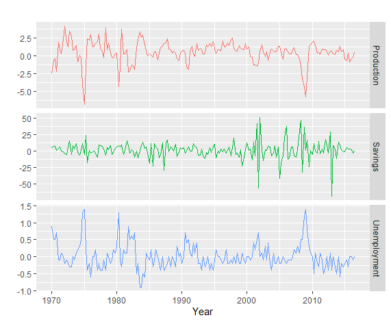
1 | autoplot(uschange[, 3:5], facets = TRUE, colour = TRUE) + |
1 | uschange %>% |
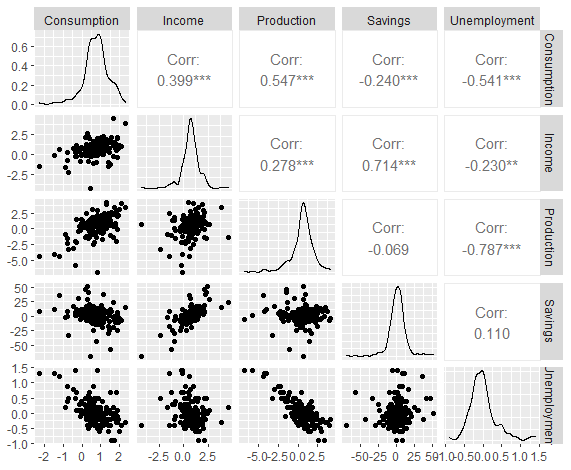
运行多元回归:
1 | fit.consMR <- tslm(Consumption ~ Income + Production + Unemployment + Savings, data = uschange) |
1 | Call: |
可见Income、Production、Savings显著,另外两个不显著。
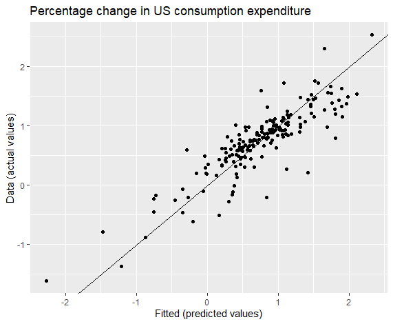
模型与实值比较:
1 | autoplot(uschange[, 'Consumption'], series = "Data") + |
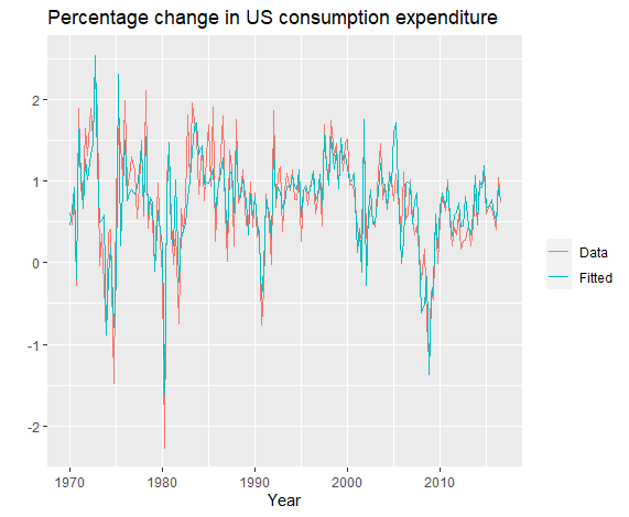
1 | cbind(Data = uschange[, "Consumption"], Fitted = fitted(fit.consMR)) %>% |
时序回归模型残差检验
前文已经讨论过优质模型的残差相关内容,这里直接实践。
1 | checkresiduals(fit.consMR) |
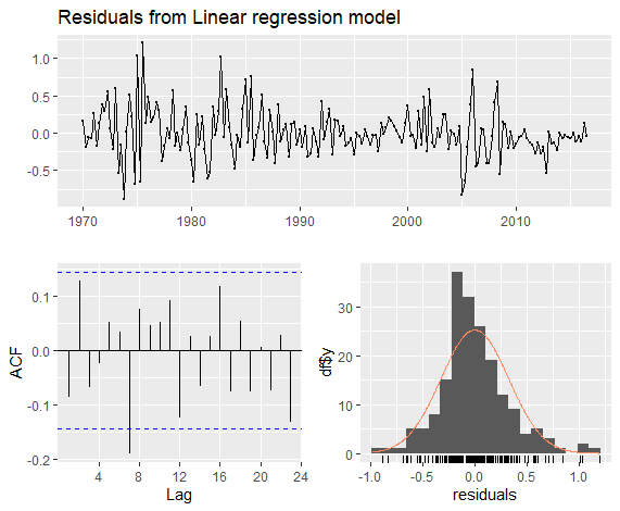
1 | Breusch-Godfrey test for serial correlation of order up to 8 |
残差均值几乎为零,相关性不显著,近似正态分布,总体还不错。
每个自变量的残差:
1 | df <- as.data.frame(uschange) |
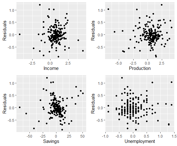
可以看出,残差与各变量间无显著相关
季度数据简单预测
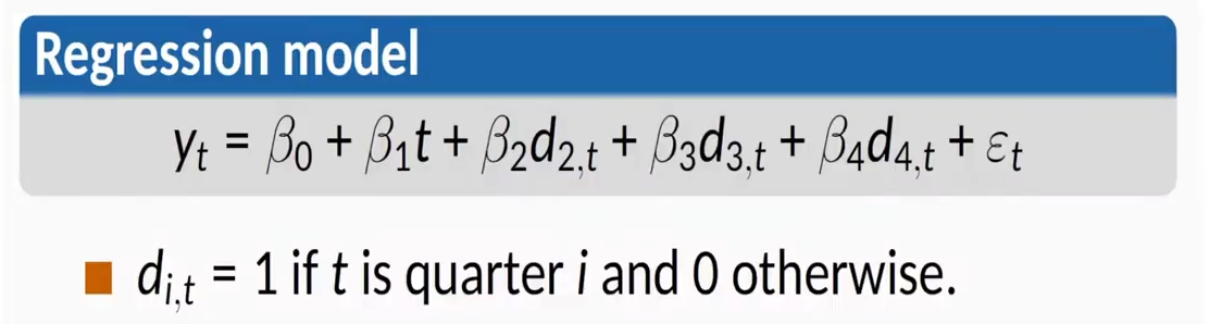
预测季节性数据,我们将模型分为两部分:t作为趋势,描述整体数据走向,然后不同的季节作为布尔类型的数据,都量入线性回归模型。
1 | beer <- window(ausbeer, start = 1992) |
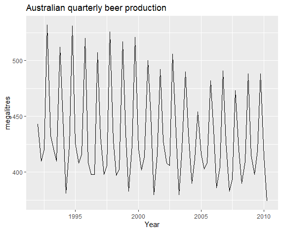
模型逻辑为下:
代码实现:
1 | fit.beer <- tslm(beer ~ trend + season) |
1 | Residuals: |
可见各项系数皆显著。
接下来将预测模型可视化:
1 | autoplot(beer, series = "Data") + |
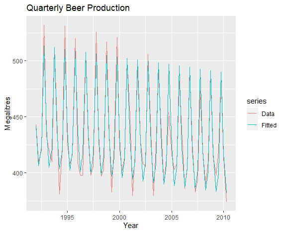
1 | cbind(Data = beer, Fitted = fitted(fit.beer)) %>% |
1 | checkresiduals(fit.beer) |
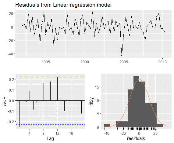
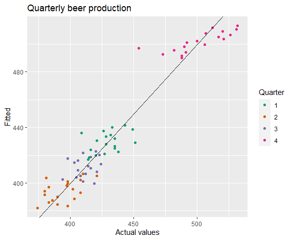
可见这个模型拟合效果在训练数据集上还是不错的.
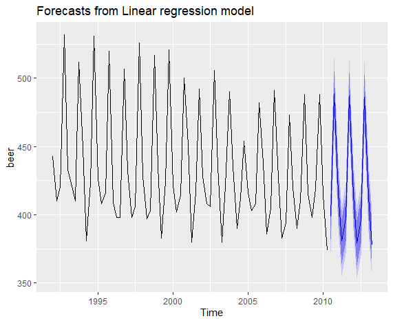
接下来我们使用上述模型进行预测:
1 | fit.beer %>% forecast %>% autoplot |
自变量选择
当可用的自变量较多时,我们该如何选择?本段主要讨论这个问题。
使用CV函数获取指标:
模型1:
1 | fit.consMR <- tslm(Consumption ~ Income + Production + Unemployment + Savings, data = uschange) |
1 | CV AIC AICc BIC AdjR2 |
模型2:
1 | fit.consMR2 <- tslm(Consumption ~ Production + Unemployment + Savings, data = uschange) |
1 | CV AIC AICc BIC AdjR2 |
这些值除了AdjR2外,越低越好,因此第一个模型更好。
各类预测
Ex-ante 预测与 Ex-post预测
Senario-based预测
这里用一个例子展示:
1
2
3
4
5
6
7
8
9
10
11
12
13
14
15
16
17
18
19
20
21fit.consBest <- tslm(Consumption ~ Income + Savings + Unemployment,
data = uschange)
h <- 4
newdata <- data.frame(
Income = c(1, 1, 1, 1),
Savings = c(0.5, 0.5, 0.5, 0.5),
Unemployment = c(0, 0, 0, 0)
)
fcast.up <- forecast(fit.consBest, newdata = newdata)
newdata <- data.frame(
Income = rep(-1, h),
Savings = rep(-0.5, h),
Unemployment = rep(0, h)
)
fcast.down <- forecast(fit.consBest, newdata = newdata)
autoplot(uschange[, 1]) +
ylab("% change in US consumption") +
autolayer(fcast.up, PI = TRUE, series = "increase") +
autolayer(fcast.down, PI = TRUE, series = "decrease") +
guides(colour = guide_legend(title = "Scenario"))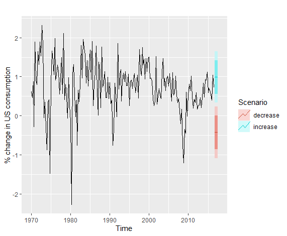
相关性与因果性(Correlation and Causation)
相关性不代表有因果性
<br>
未完待续…
由于当前内容已经超出本文目录所能承载的极限,故本文完结,后续内容将在[时序分析学习笔记(二)]中继续。